
My VW
App homepage redesign · 2025
Context
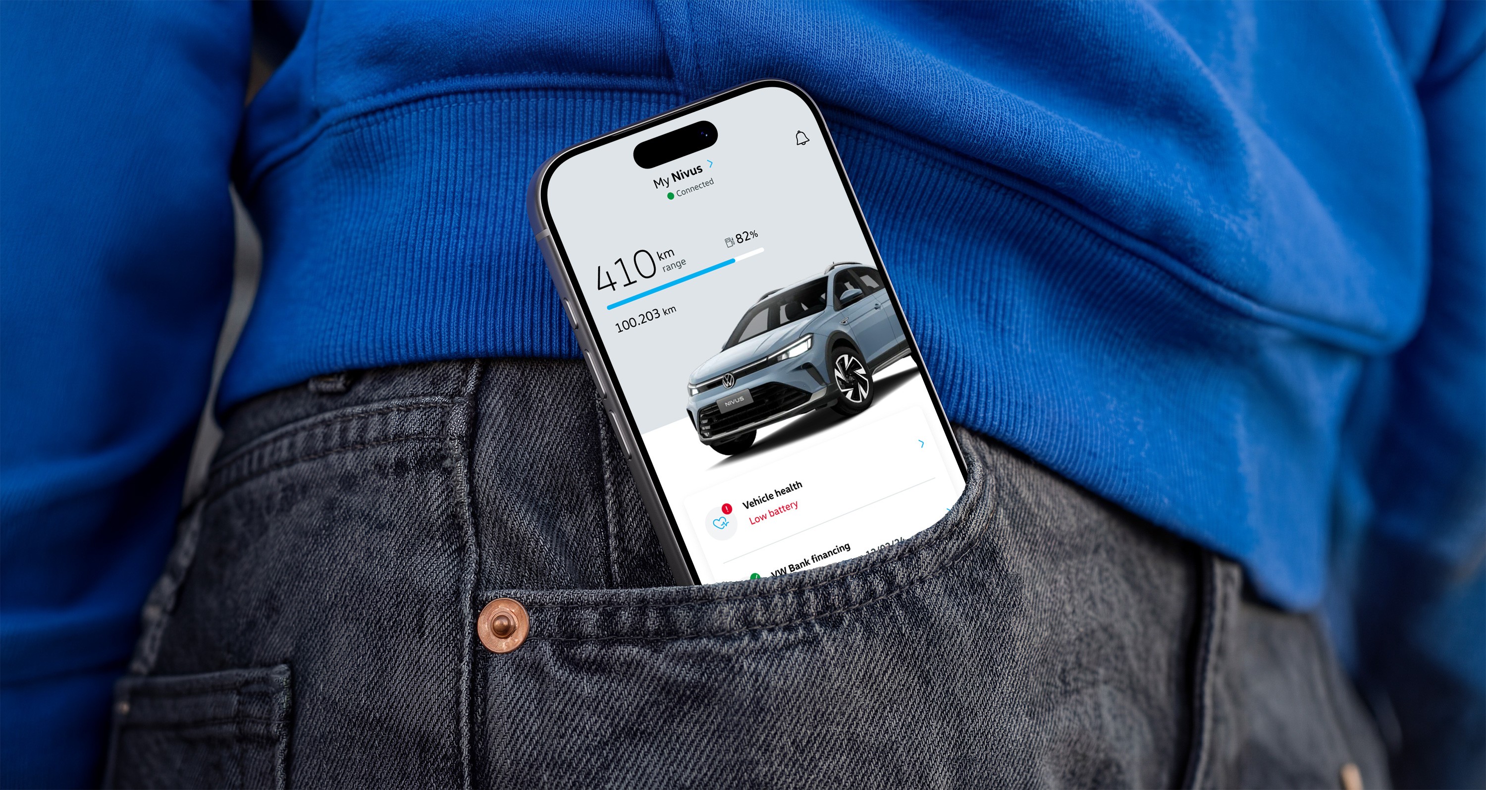
Meu VW is Volkswagen Brazil's official app. Through it, drivers can check their vehicle's status, trigger remote functions, schedule maintenance, manage financing, read the manual, and more. For Volkswagen, the app was a strategic bet: the primary channel for direct customer relationship after a purchase.
The problem was that the homepage didn't live up to that ambition. Users arrived after a long, demanding registration flow, expectations were high, only to find a generic, disorganized screen with low perceived value. The information was there, but poorly structured, with technical terminology and formats that made it hard to understand. The app promised a personalized experience and delivered the opposite.
Usability test participant
"I'd love to see information that's actually about my VW. Here I'm just looking at a generic page with my car's color."
Usability test participant
"The app is called My VW. I don't want something that feels more like VW. I want something that feels more like mine."
My role
I was the design lead on this project: the person making design decisions, running and participating in usability tests, and the main point of contact with the client. Over time I also became the one who knew the app most deeply, not just the design flows but the technical constraints and business priorities behind them.
At different points in the project I worked alongside a UX designer, a junior designer, and a mid-level designer, guiding their work and delegating tasks. For the homepage redesign specifically, I was the only responsible for the execution, with the team involved in reviews and critiques.
The homepage redesign itself wasn't a scoped task. It came out of usability tests I was running for other parts of the app. The patterns were consistent enough that I put together a case for why the homepage needed to be addressed, and took it to the client. That's what got it prioritized.
The core problems
Usability tests conducted on the previous version of the app confirmed what the interviews had already suggested. Six users were invited explore the app, half with limited usage history and half who had never opened it before.
Problem 1: hierarchy
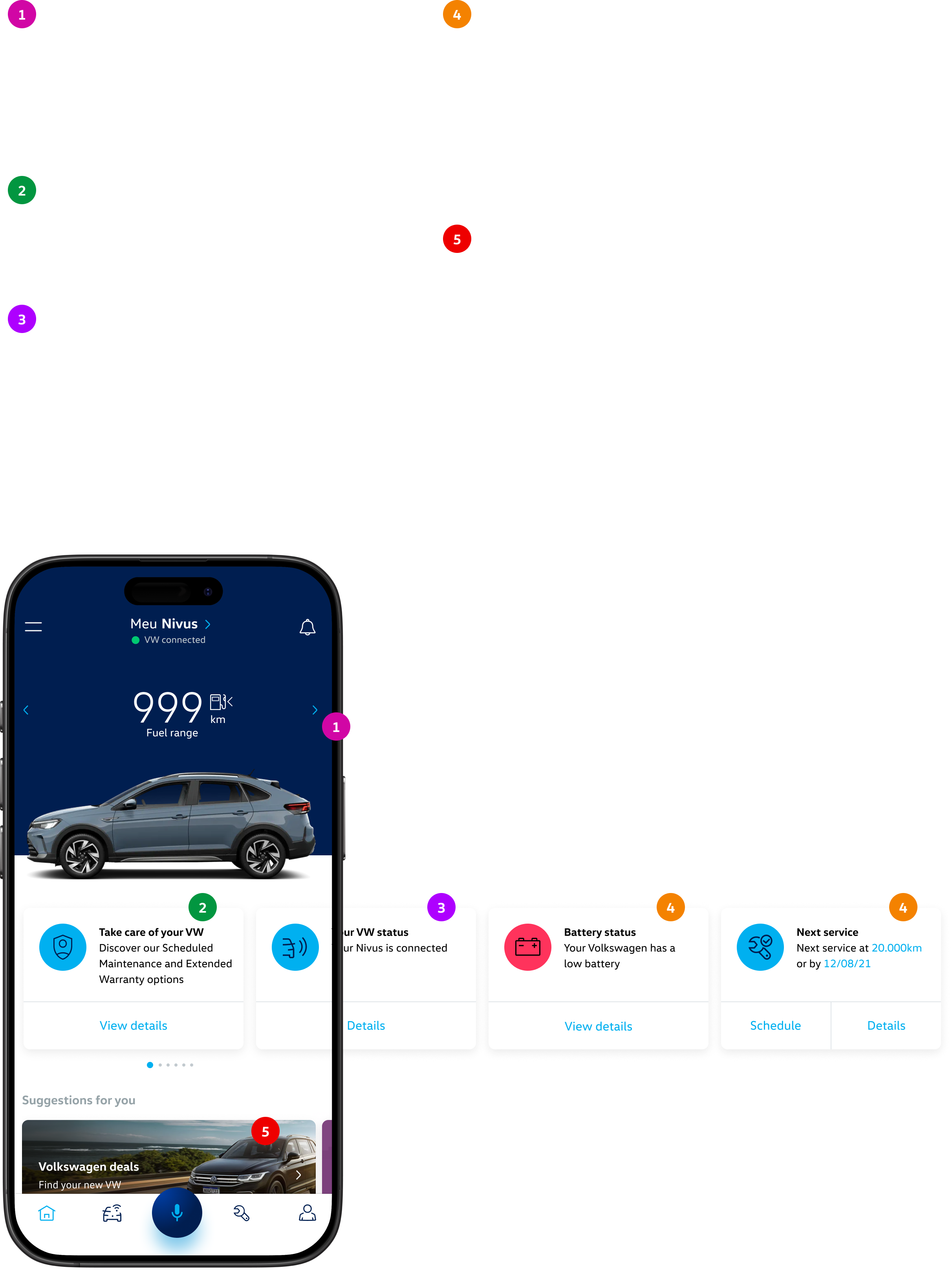
Every participant considered service scheduling the most important feature in the app, yet none of them could find it easily. The card carousel was the only place where most of the app's available features appeared, holding up to 13 items across completely different topics. The information was there, but the format made it inaccessible. On top of that, the ordering prioritized promotional content over vehicle-specific information, so anyone trying to check their car's status had to scroll past offers first.
Problem 2: personalization
The app already knew a lot about the user: the vehicle, the chosen dealership, service history, financing status, and much more. But none of that was used to make the experience more relevant. Someone who had just bought a new car was immediately shown ads for new vehicles. The dealership chosen during registration was buried in the carousel. The homepage looked the same for everyone.
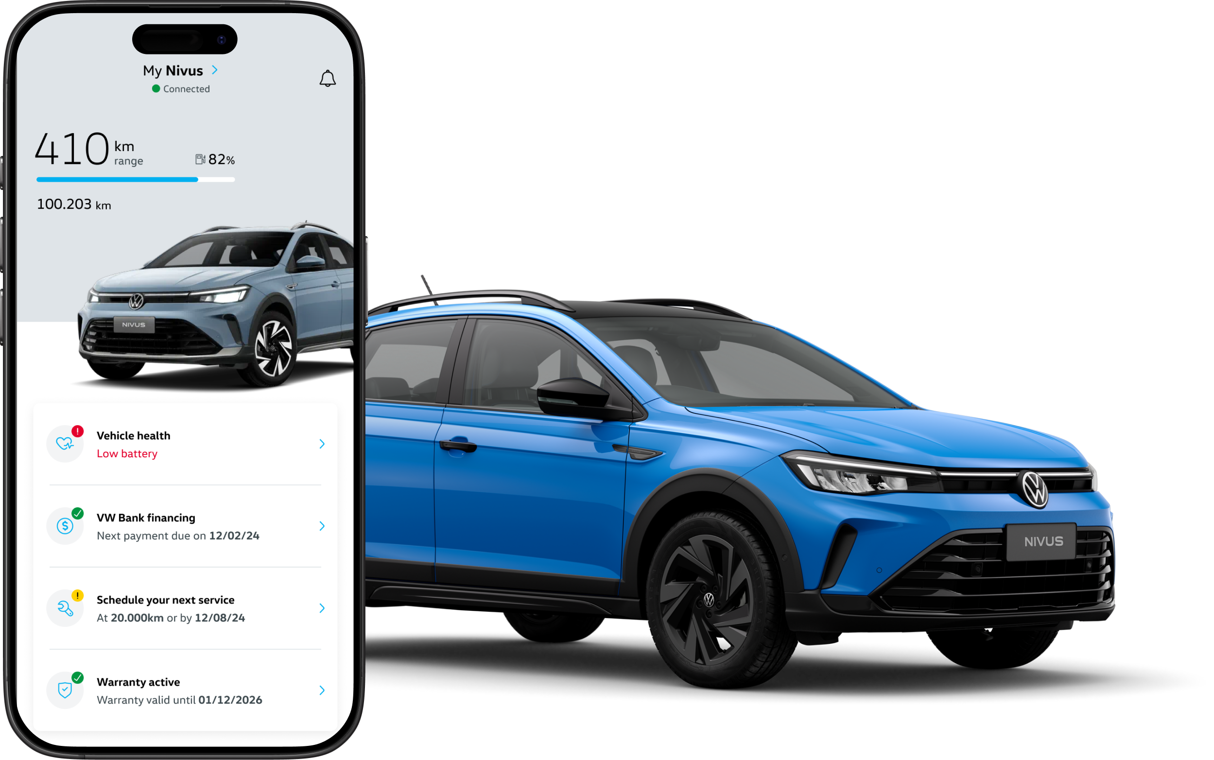
The goal of the redesign was clear: turn the homepage into a quick-reference dashboard for the vehicle, with a hierarchy that reflected actual user priorities and content that made sense for each person's moment.
PREVIOUS VERSION
Design decisions
Making the data readable
Fuel range was already at the top of the homepage before the redesign. The problem wasn't its position, it was how it was displayed. The previous version showed three pieces of information through sequential taps: fuel range in km, fuel level on a scale from 0 to 1, and total mileage. Each data point on a separate screen, with no context connecting them.
Usability tests, interviews, and App Store reviews all pointed to the same problem: people couldn't make sense of those values. What does 410 km of range actually mean? Without knowing how much fuel is left in the tank, the number in km tells you very little on its own.
The decision was to consolidate all three into a single screen and replace the 0-to-1 scale with a progress bar showing the tank as a percentage. A number like 82% full is much easier to grasp than an abstract scale. The bar also got a color system: blue when the level is comfortable, yellow when it starts getting low, and red when it's time to refuel. The color does the work of alerting the user without requiring any mental calculation.
On top of that, the information that previously required tapping through arrows to reveal is now all visible at once, with no extra interaction needed. The logic is simple: the data already existed. What was missing was a way to understand it.
PREVIOUS VERSION
REDESIGN
Replacing the carousel with a list
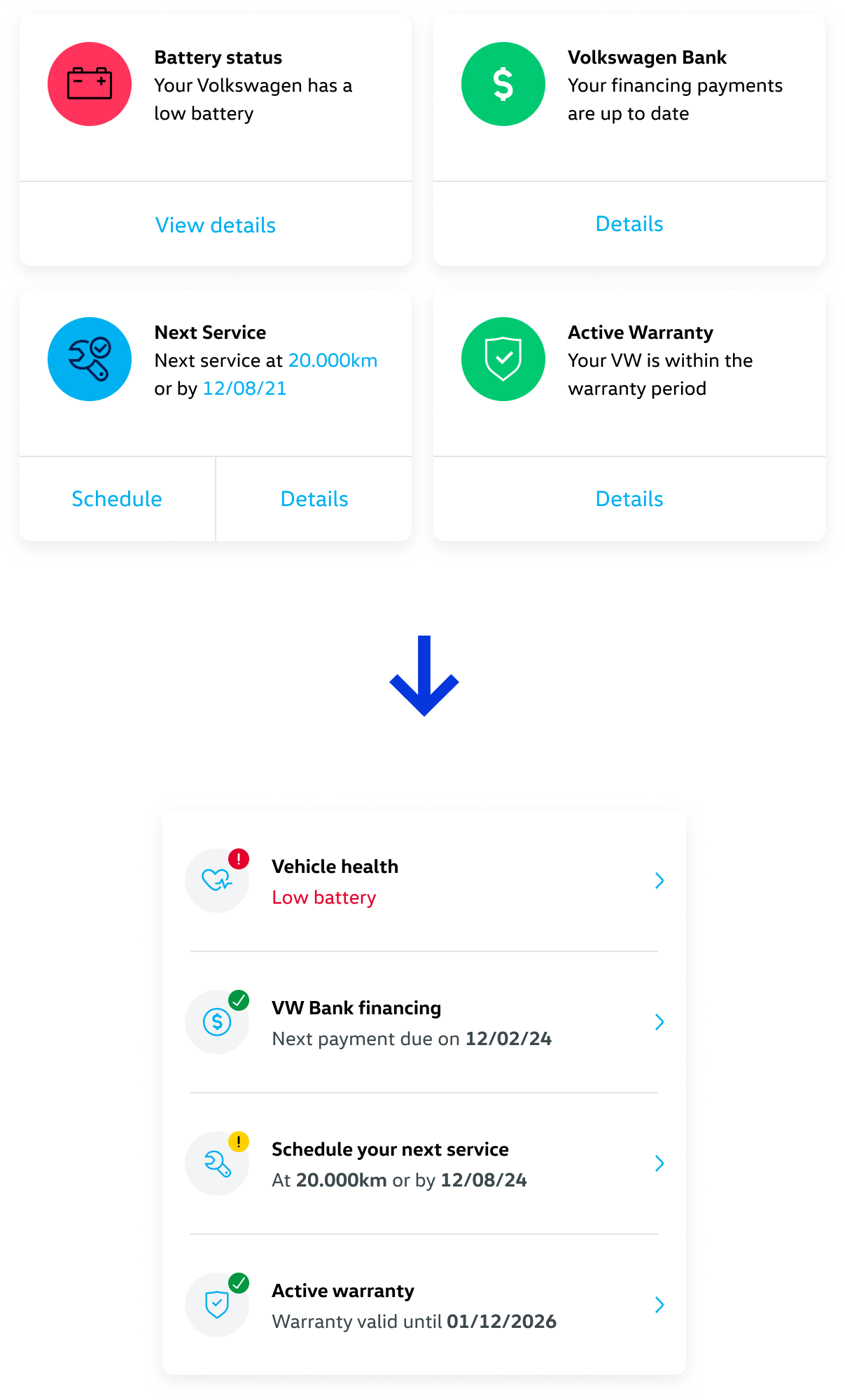
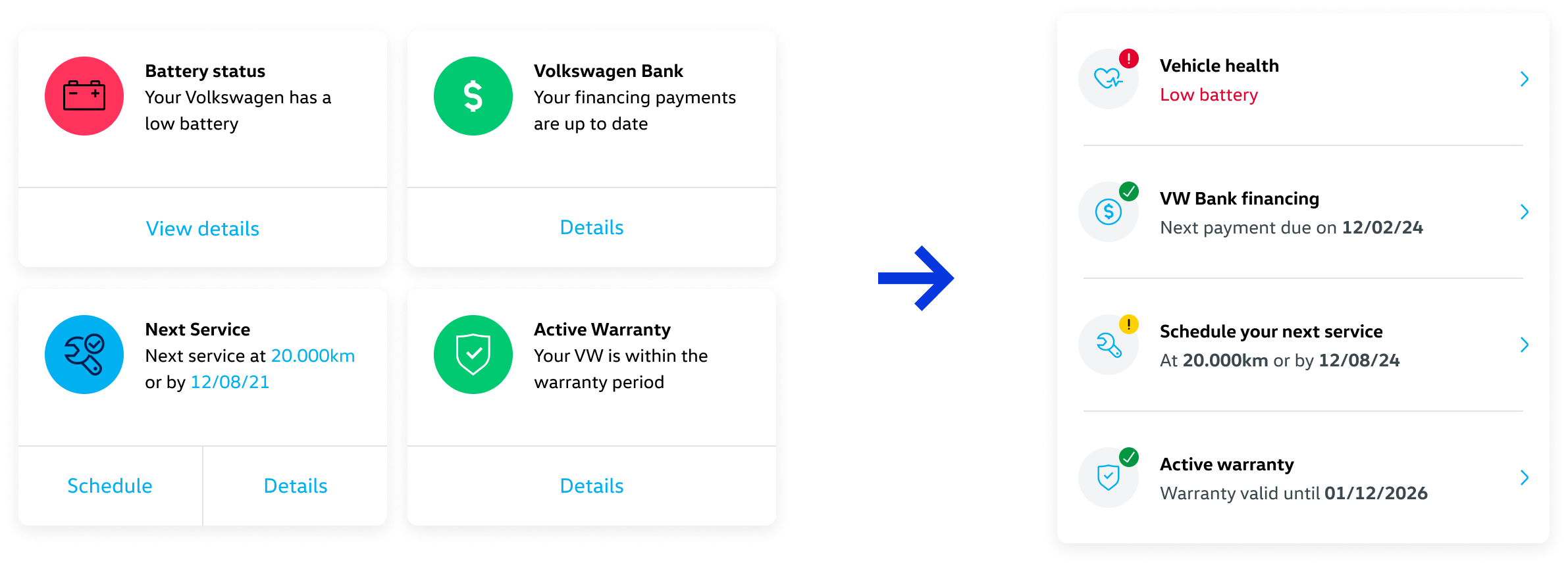
The carousel was replaced by a vertical list of essential status items. The format change wasn't aesthetic. The carousel required interaction to reveal information, and users simply weren't doing that. Battery status, upcoming service, financing status, everything was hidden behind an interaction that never happened. The list shows everything at once, no extra taps needed, and matches the real behavior of someone checking the app quickly.
Along with the format change, I created a visual status system that didn't exist before. Each item on the list has an icon and a color that communicate the situation immediately: green with a checkmark when everything is fine, yellow when attention is needed, and red when something is critical and requires action. The copy also changes according to the status, reinforcing the message. The previous version had colors on the cards, but with no clear logic, which made it hard to notice those colors were trying to say something.
This system applies to every item on the list. For vehicle health, it alerts when a problem is detected. For financing, when a payment is due soon or overdue. For service, when it's getting close or already past due. For warranty, when a condition has been breached or when there's still time to act. The user opens the app and within seconds knows if anything needs attention.
Giving promotional content a worthy format
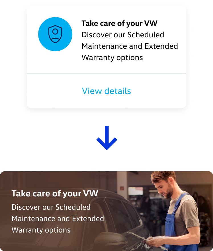
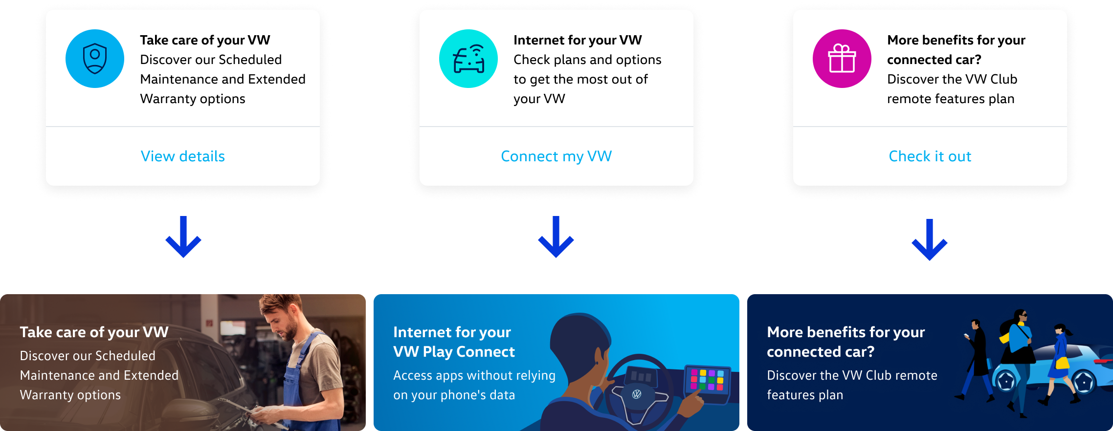
In the previous homepage, the first card in the carousel was "Take care of your VW," a promotional card for services like planned maintenance and extended warranty. It shared space with battery status, financing, and service reminders, with no hierarchy between them.
The solution wasn't to remove that content, it was to elevate it. Promotional cards were moved to a dedicated section called "Suggestions for you," displayed as image banners, far more compelling than a card in the middle of a carousel. And the display started following a contextual logic: when the data indicated a customer was approaching the moment to buy a new car, an offer banner appeared. When it made more sense to promote maintenance services, "Take care of your VW" appeared instead. Promotional content didn't lose space, it gained relevance.
Preferred dealership with complete information
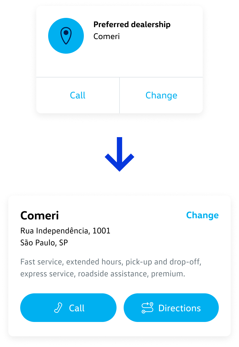
The app required users to select a preferred dealership during registration. But that information ended up buried among the last items in the carousel, with no visibility, and it was the only place where it could be viewed or changed. The suggestion was a card on the homepage with the dealership's full details: name, address, available services, and shortcuts to call or get directions. Information the user already provided was made visible and useful.
Design infrastructure
Early in the project, it became clear there was a structural problem that needed to be solved before any redesign could happen: the design work for the app was completely scattered. Multiple teams were working on Meu VW simultaneously, each with their own files, references, and components. There was no shared foundation. The result was constant rework, visual inconsistencies, and no reliable way to understand the actual state of the product.
I identified this problem and took the initiative to address it on two fronts, before moving on to the homepage redesign. By the time we got to the homepage, this work was well underway and made a real difference in both the speed and quality of execution.
The first was componentization. I raised the need to prioritize this work because I knew it would directly impact the quality and speed of everything that came after. I led and executed the componentization of all existing screens in the app alongside the rest of the design team, building a component library that became the single shared foundation for everyone. By the end, the library had 23 categories and 345 components and their variations.
The second was the Experience Map. I led and did most of the work on a Figma document built from scratch with support from the team, covering every existing screen and flow in the app, organized so that anyone could understand the full product without needing to download the app or have an account with a registered vehicle. The document is a living file: it needs to be updated whenever a screen or flow goes into development. It became a reference for everyone involved in the product, such as clients, developers, PMs, and designers, making the full size and complexity of Meu VW visible in a way that hadn't existed before.
Outcome
The homepage redesign turned a generic screen into a quick-reference dashboard for the vehicle. The reorganization of information and the clear separation between status and promotional content brought the app closer to what it had always promised to be: a direct line between drivers and their car, even when they're not in it.
Click to see the prototype
Next work →

My VW
App homepage redesign · 2025
Context
Meu VW is Volkswagen Brazil's official app. Through it, drivers can check their vehicle's status, trigger remote functions, schedule maintenance, manage financing, read the manual, and more. For Volkswagen, the app was a strategic bet: the primary channel for direct customer relationship after a purchase.
The problem was that the homepage didn't live up to that ambition. Users arrived after a long, demanding registration flow, expectations were high, only to find a generic, disorganized screen with low perceived value. The information was there, but poorly structured, with technical terminology and formats that made it hard to understand. The app promised a personalized experience and delivered the opposite.
Usability test participant
"I'd love to see information that's actually about my VW. Here I'm just looking at a generic page with my car's color."
Usability test participant
"The app is called My VW. I don't want something that feels more like VW. I want something that feels more like mine."
My role
I was the design lead on this project: the person making design decisions, running and participating in usability tests, and the main point of contact with the client. Over time I also became the one who knew the app most deeply, not just the design flows but the technical constraints and business priorities behind them.
At different points in the project I worked alongside a UX designer, a junior designer, and a mid-level designer, guiding their work and delegating tasks. For the homepage redesign specifically, I was the only responsible for the execution, with the team involved in reviews and critiques.
The homepage redesign itself wasn't a scoped task. It came out of usability tests I was running for other parts of the app. The patterns were consistent enough that I put together a case for why the homepage needed to be addressed, and took it to the client. That's what got it prioritized.
The core problems
Usability tests conducted on the previous version of the app confirmed what the interviews had already suggested. Six users were invited explore the app, half with limited usage history and half who had never opened it before.
Problem 1: hierarchy
Every participant considered service scheduling the most important feature in the app, yet none of them could find it easily. The card carousel was the only place where most of the app's available features appeared, holding up to 13 items across completely different topics. The information was there, but the format made it inaccessible. On top of that, the ordering prioritized promotional content over vehicle-specific information, so anyone trying to check their car's status had to scroll past offers first.
Problem 2: personalization
The app already knew a lot about the user: the vehicle, the chosen dealership, service history, financing status, and much more. But none of that was used to make the experience more relevant. Someone who had just bought a new car was immediately shown ads for new vehicles. The dealership chosen during registration was buried in the carousel. The homepage looked the same for everyone.
The goal of the redesign was clear: turn the homepage into a quick-reference dashboard for the vehicle, with a hierarchy that reflected actual user priorities and content that made sense for each person's moment.
PREVIOUS VERSION
Design decisions
Making the data readable
Fuel range was already at the top of the homepage before the redesign. The problem wasn't its position, it was how it was displayed. The previous version showed three pieces of information through sequential taps: fuel range in km, fuel level on a scale from 0 to 1, and total mileage. Each data point on a separate screen, with no context connecting them.
Usability tests, interviews, and App Store reviews all pointed to the same problem: people couldn't make sense of those values. What does 410 km of range actually mean? Without knowing how much fuel is left in the tank, the number in km tells you very little on its own.
The decision was to consolidate all three into a single screen and replace the 0-to-1 scale with a progress bar showing the tank as a percentage. A number like 82% full is much easier to grasp than an abstract scale. The bar also got a color system: blue when the level is comfortable, yellow when it starts getting low, and red when it's time to refuel. The color does the work of alerting the user without requiring any mental calculation.
On top of that, the information that previously required tapping through arrows to reveal is now all visible at once, with no extra interaction needed. The logic is simple: the data already existed. What was missing was a way to understand it.
PREVIOUS VERSION
REDESIGN
Replacing the carousel with a list
The carousel was replaced by a vertical list of essential status items. The format change wasn't aesthetic. The carousel required interaction to reveal information, and users simply weren't doing that. Battery status, upcoming service, financing status, everything was hidden behind an interaction that never happened. The list shows everything at once, no extra taps needed, and matches the real behavior of someone checking the app quickly.
Along with the format change, I created a visual status system that didn't exist before. Each item on the list has an icon and a color that communicate the situation immediately: green with a checkmark when everything is fine, yellow when attention is needed, and red when something is critical and requires action. The copy also changes according to the status, reinforcing the message. The previous version had colors on the cards, but with no clear logic, which made it hard to notice those colors were trying to say something.
This system applies to every item on the list. For vehicle health, it alerts when a problem is detected. For financing, when a payment is due soon or overdue. For service, when it's getting close or already past due. For warranty, when a condition has been breached or when there's still time to act. The user opens the app and within seconds knows if anything needs attention.
Giving promotional content a worthy format
In the previous homepage, the first card in the carousel was "Take care of your VW," a promotional card for services like planned maintenance and extended warranty. It shared space with battery status, financing, and service reminders, with no hierarchy between them.
The solution wasn't to remove that content, it was to elevate it. Promotional cards were moved to a dedicated section called "Suggestions for you," displayed as image banners, far more compelling than a card in the middle of a carousel. And the display started following a contextual logic: when the data indicated a customer was approaching the moment to buy a new car, an offer banner appeared. When it made more sense to promote maintenance services, "Take care of your VW" appeared instead. Promotional content didn't lose space, it gained relevance.
Preferred dealership with complete information
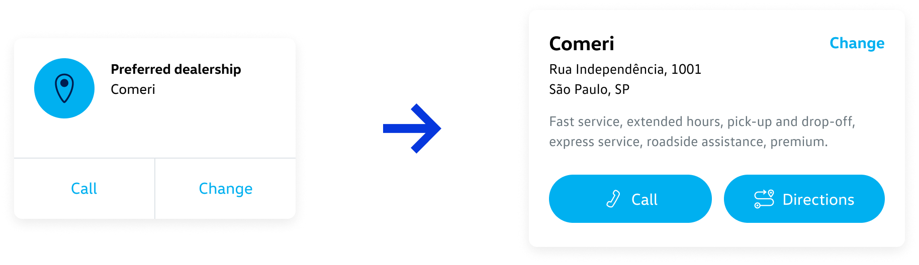
The app required users to select a preferred dealership during registration. But that information ended up buried among the last items in the carousel, with no visibility, and it was the only place where it could be viewed or changed. The suggestion was a card on the homepage with the dealership's full details: name, address, available services, and shortcuts to call or get directions. Information the user already provided was made visible and useful.
Design infrastructure
Early in the project, it became clear there was a structural problem that needed to be solved before any redesign could happen: the design work for the app was completely scattered. Multiple teams were working on Meu VW simultaneously, each with their own files, references, and components. There was no shared foundation. The result was constant rework, visual inconsistencies, and no reliable way to understand the actual state of the product.
I identified this problem and took the initiative to address it on two fronts, before moving on to the homepage redesign. By the time we got to the homepage, this work was well underway and made a real difference in both the speed and quality of execution.
The first was componentization. I raised the need to prioritize this work because I knew it would directly impact the quality and speed of everything that came after. I led and executed the componentization of all existing screens in the app alongside the rest of the design team, building a component library that became the single shared foundation for everyone. By the end, the library had 23 categories and 345 components and their variations.
The second was the Experience Map. I led and did most of the work on a Figma document built from scratch with support from the team, covering every existing screen and flow in the app, organized so that anyone could understand the full product without needing to download the app or have an account with a registered vehicle. The document is a living file: it needs to be updated whenever a screen or flow goes into development. It became a reference for everyone involved in the product, such as clients, developers, PMs, and designers, making the full size and complexity of Meu VW visible in a way that hadn't existed before.
Outcome
The homepage redesign turned a generic screen into a quick-reference dashboard for the vehicle. The reorganization of information and the clear separation between status and promotional content brought the app closer to what it had always promised to be: a direct line between drivers and their car, even when they're not in it.
Click to see the prototype
Next work →

My VW
App homepage redesign · 2025
Context
Meu VW is Volkswagen Brazil's official app. Through it, drivers can check their vehicle's status, trigger remote functions, schedule maintenance, manage financing, read the manual, and more. For Volkswagen, the app was a strategic bet: the primary channel for direct customer relationship after a purchase.
The problem was that the homepage didn't live up to that ambition. Users arrived after a long, demanding registration flow, expectations were high, only to find a generic, disorganized screen with low perceived value. The information was there, but poorly structured, with technical terminology and formats that made it hard to understand. The app promised a personalized experience and delivered the opposite.
Usability test participant
"I'd love to see information that's actually about my VW. Here I'm just looking at a generic page with my car's color."
Usability test participant
"The app is called My VW. I don't want something that feels more like VW. I want something that feels more like mine."
My role
I was the design lead on this project: the person making design decisions, running and participating in usability tests, and the main point of contact with the client. Over time I also became the one who knew the app most deeply, not just the design flows but the technical constraints and business priorities behind them.
At different points in the project I worked alongside a UX designer, a junior designer, and a mid-level designer, guiding their work and delegating tasks. For the homepage redesign specifically, I was the only responsible for the execution, with the team involved in reviews and critiques.
The homepage redesign itself wasn't a scoped task. It came out of usability tests I was running for other parts of the app. The patterns were consistent enough that I put together a case for why the homepage needed to be addressed, and took it to the client. That's what got it prioritized.
The core problems
Usability tests conducted on the previous version of the app confirmed what the interviews had already suggested. Six users were invited explore the app, half with limited usage history and half who had never opened it before.
Problem 1: hierarchy
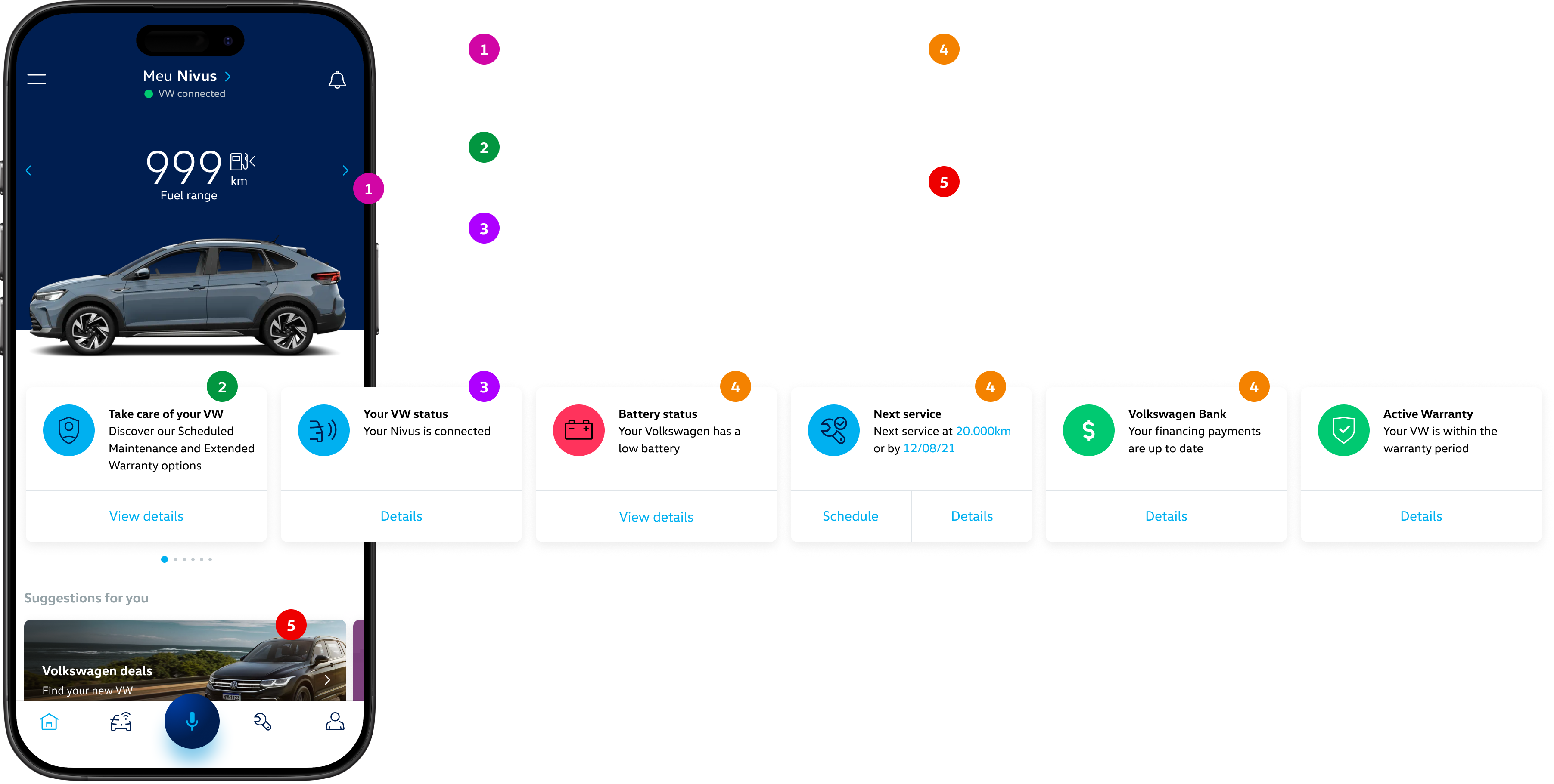
Every participant considered service scheduling the most important feature in the app, yet none of them could find it easily. The card carousel was the only place where most of the app's available features appeared, holding up to 13 items across completely different topics. The information was there, but the format made it inaccessible. On top of that, the ordering prioritized promotional content over vehicle-specific information, so anyone trying to check their car's status had to scroll past offers first.
Problem 2: personalization
The app already knew a lot about the user: the vehicle, the chosen dealership, service history, financing status, and much more. But none of that was used to make the experience more relevant. Someone who had just bought a new car was immediately shown ads for new vehicles. The dealership chosen during registration was buried in the carousel. The homepage looked the same for everyone.
The goal of the redesign was clear: turn the homepage into a quick-reference dashboard for the vehicle, with a hierarchy that reflected actual user priorities and content that made sense for each person's moment.
PREVIOUS VERSION
Design decisions
Making the data readable
Fuel range was already at the top of the homepage before the redesign. The problem wasn't its position, it was how it was displayed. The previous version showed three pieces of information through sequential taps: fuel range in km, fuel level on a scale from 0 to 1, and total mileage. Each data point on a separate screen, with no context connecting them.
Usability tests, interviews, and App Store reviews all pointed to the same problem: people couldn't make sense of those values. What does 410 km of range actually mean? Without knowing how much fuel is left in the tank, the number in km tells you very little on its own.
The decision was to consolidate all three into a single screen and replace the 0-to-1 scale with a progress bar showing the tank as a percentage. A number like 82% full is much easier to grasp than an abstract scale. The bar also got a color system: blue when the level is comfortable, yellow when it starts getting low, and red when it's time to refuel. The color does the work of alerting the user without requiring any mental calculation.
On top of that, the information that previously required tapping through arrows to reveal is now all visible at once, with no extra interaction needed. The logic is simple: the data already existed. What was missing was a way to understand it.
PREVIOUS VERSION
REDESIGN
Replacing the carousel with a list
The carousel was replaced by a vertical list of essential status items. The format change wasn't aesthetic. The carousel required interaction to reveal information, and users simply weren't doing that. Battery status, upcoming service, financing status, everything was hidden behind an interaction that never happened. The list shows everything at once, no extra taps needed, and matches the real behavior of someone checking the app quickly.
Along with the format change, I created a visual status system that didn't exist before. Each item on the list has an icon and a color that communicate the situation immediately: green with a checkmark when everything is fine, yellow when attention is needed, and red when something is critical and requires action. The copy also changes according to the status, reinforcing the message. The previous version had colors on the cards, but with no clear logic, which made it hard to notice those colors were trying to say something.
This system applies to every item on the list. For vehicle health, it alerts when a problem is detected. For financing, when a payment is due soon or overdue. For service, when it's getting close or already past due. For warranty, when a condition has been breached or when there's still time to act. The user opens the app and within seconds knows if anything needs attention.
Giving promotional content a worthy format
In the previous homepage, the first card in the carousel was "Take care of your VW," a promotional card for services like planned maintenance and extended warranty. It shared space with battery status, financing, and service reminders, with no hierarchy between them.
The solution wasn't to remove that content, it was to elevate it. Promotional cards were moved to a dedicated section called "Suggestions for you," displayed as image banners, far more compelling than a card in the middle of a carousel. And the display started following a contextual logic: when the data indicated a customer was approaching the moment to buy a new car, an offer banner appeared. When it made more sense to promote maintenance services, "Take care of your VW" appeared instead. Promotional content didn't lose space, it gained relevance.
Preferred dealership with complete information
The app required users to select a preferred dealership during registration. But that information ended up buried among the last items in the carousel, with no visibility, and it was the only place where it could be viewed or changed. The suggestion was a card on the homepage with the dealership's full details: name, address, available services, and shortcuts to call or get directions. Information the user already provided was made visible and useful.
Design infrastructure
Early in the project, it became clear there was a structural problem that needed to be solved before any redesign could happen: the design work for the app was completely scattered. Multiple teams were working on Meu VW simultaneously, each with their own files, references, and components. There was no shared foundation. The result was constant rework, visual inconsistencies, and no reliable way to understand the actual state of the product.
I identified this problem and took the initiative to address it on two fronts, before moving on to the homepage redesign. By the time we got to the homepage, this work was well underway and made a real difference in both the speed and quality of execution.
The first was componentization. I raised the need to prioritize this work because I knew it would directly impact the quality and speed of everything that came after. I led and executed the componentization of all existing screens in the app alongside the rest of the design team, building a component library that became the single shared foundation for everyone. By the end, the library had 23 categories and 345 components and their variations.
The second was the Experience Map. I led and did most of the work on a Figma document built from scratch with support from the team, covering every existing screen and flow in the app, organized so that anyone could understand the full product without needing to download the app or have an account with a registered vehicle. The document is a living file: it needs to be updated whenever a screen or flow goes into development. It became a reference for everyone involved in the product, such as clients, developers, PMs, and designers, making the full size and complexity of Meu VW visible in a way that hadn't existed before.
Outcome
The homepage redesign turned a generic screen into a quick-reference dashboard for the vehicle. The reorganization of information and the clear separation between status and promotional content brought the app closer to what it had always promised to be: a direct line between drivers and their car, even when they're not in it.
Click to see the prototype
Next work →

My VW
App homepage redesign · 2025
Context
My VW is Volkswagen Brazil's official app. Through it, drivers can check their vehicle's status, trigger remote functions, schedule maintenance, manage financing, read the manual, and more. For Volkswagen, the app was a strategic bet: the primary channel for direct customer relationship after a purchase.
The problem was that the homepage didn't live up to that ambition. Users arrived after a long, demanding registration flow, expectations were high, only to find a generic, disorganized screen with low perceived value. The information was there, but poorly structured, with technical terminology and formats that made it hard to understand. The app promised a personalized experience and delivered the opposite.
Usability test participant
"I'd love to see information that's actually about my VW. Here I'm just looking at a generic page with my car's color."
Usability test participant
"The app is called My VW. I don't want something that feels more like VW. I want something that feels more like mine."
My role
I was the design lead on this project: the person making design decisions, running and participating in usability tests, and the main point of contact with the client. Over time I also became the one who knew the app most deeply, not just the design flows but the technical constraints and business priorities behind them.
At different points in the project I worked alongside a UX designer, a junior designer, and a mid-level designer, guiding their work and delegating tasks. For the homepage redesign specifically, I was the only responsible for the execution, with the team involved in reviews and critiques.
The homepage redesign itself wasn't a scoped task. It came out of usability tests I was running for other parts of the app. The patterns were consistent enough that I put together a case for why the homepage needed to be addressed, and took it to the client. That's what got it prioritized.
The core problems
Usability tests conducted on the previous version of the app confirmed what the interviews had already suggested. Six users were invited explore the app, half with limited usage history and half who had never opened it before.
Problem 1: hierarchy
Every participant considered service scheduling the most important feature in the app, yet none of them could find it easily. The card carousel was the only place where most of the app's available features appeared, holding up to 13 items across completely different topics. The information was there, but the format made it inaccessible. On top of that, the ordering prioritized promotional content over vehicle-specific information, so anyone trying to check their car's status had to scroll past offers first.
Problem 2: personalization
The app already knew a lot about the user: the vehicle, the chosen dealership, service history, financing status, and much more. But none of that was used to make the experience more relevant. Someone who had just bought a new car was immediately shown ads for new vehicles. The dealership chosen during registration was buried in the carousel. The homepage looked the same for everyone.
The goal of the redesign was clear: turn the homepage into a quick-reference dashboard for the vehicle, with a hierarchy that reflected actual user priorities and content that made sense for each person's moment.
PREVIOUS VERSION
Design decisions
Making the data readable
Fuel range was already at the top of the homepage before the redesign. The problem wasn't its position, it was how it was displayed. The previous version showed three pieces of information through sequential taps: fuel range in km, fuel level on a scale from 0 to 1, and total mileage. Each data point on a separate screen, with no context connecting them.
Usability tests, interviews, and App Store reviews all pointed to the same problem: people couldn't make sense of those values. What does 410 km of range actually mean? Without knowing how much fuel is left in the tank, the number in km tells you very little on its own.
The decision was to consolidate all three into a single screen and replace the 0-to-1 scale with a progress bar showing the tank as a percentage. A number like 82% full is much easier to grasp than an abstract scale. The bar also got a color system: blue when the level is comfortable, yellow when it starts getting low, and red when it's time to refuel. The color does the work of alerting the user without requiring any mental calculation.
On top of that, the information that previously required tapping through arrows to reveal is now all visible at once, with no extra interaction needed. The logic is simple: the data already existed. What was missing was a way to understand it.
PREVIOUS VERSION
REDESIGN
Replacing the carousel with a list
The carousel was replaced by a vertical list of essential status items. The format change wasn't aesthetic. The carousel required interaction to reveal information, and users simply weren't doing that. Battery status, upcoming service, financing status, everything was hidden behind an interaction that never happened. The list shows everything at once, no extra taps needed, and matches the real behavior of someone checking the app quickly.
Along with the format change, I created a visual status system that didn't exist before. Each item on the list has an icon and a color that communicate the situation immediately: green with a checkmark when everything is fine, yellow when attention is needed, and red when something is critical and requires action. The copy also changes according to the status, reinforcing the message. The previous version had colors on the cards, but with no clear logic, which made it hard to notice those colors were trying to say something.
This system applies to every item on the list. For vehicle health, it alerts when a problem is detected. For financing, when a payment is due soon or overdue. For service, when it's getting close or already past due. For warranty, when a condition has been breached or when there's still time to act. The user opens the app and within seconds knows if anything needs attention.
Giving promotional content a worthy format
In the previous homepage, the first card in the carousel was "Take care of your VW," a promotional card for services like planned maintenance and extended warranty. It shared space with battery status, financing, and service reminders, with no hierarchy between them.
The solution wasn't to remove that content, it was to elevate it. Promotional cards were moved to a dedicated section called "Suggestions for you," displayed as image banners, far more compelling than a card in the middle of a carousel. And the display started following a contextual logic: when the data indicated a customer was approaching the moment to buy a new car, an offer banner appeared. When it made more sense to promote maintenance services, "Take care of your VW" appeared instead. Promotional content didn't lose space, it gained relevance.
Preferred dealership with complete information
The app required users to select a preferred dealership during registration. But that information ended up buried among the last items in the carousel, with no visibility, and it was the only place where it could be viewed or changed. The suggestion was a card on the homepage with the dealership's full details: name, address, available services, and shortcuts to call or get directions. Information the user already provided was made visible and useful.
Design infrastructure
Early in the project, it became clear there was a structural problem that needed to be solved before any redesign could happen: the design work for the app was completely scattered. Multiple teams were working on Meu VW simultaneously, each with their own files, references, and components. There was no shared foundation. The result was constant rework, visual inconsistencies, and no reliable way to understand the actual state of the product.
I identified this problem and took the initiative to address it on two fronts, before moving on to the homepage redesign. By the time we got to the homepage, this work was well underway and made a real difference in both the speed and quality of execution.
The first was componentization. I raised the need to prioritize this work because I knew it would directly impact the quality and speed of everything that came after. I led and executed the componentization of all existing screens in the app alongside the rest of the design team, building a component library that became the single shared foundation for everyone. By the end, the library had 23 categories and 345 components and their variations.
The second was the Experience Map. I led and did most of the work on a Figma document built from scratch with support from the team, covering every existing screen and flow in the app, organized so that anyone could understand the full product without needing to download the app or have an account with a registered vehicle. The document is a living file: it needs to be updated whenever a screen or flow goes into development. It became a reference for everyone involved in the product, such as clients, developers, PMs, and designers, making the full size and complexity of Meu VW visible in a way that hadn't existed before.
Outcome
The homepage redesign turned a generic screen into a quick-reference dashboard for the vehicle. The reorganization of information and the clear separation between status and promotional content brought the app closer to what it had always promised to be: a direct line between drivers and their car, even when they're not in it.
Click to see the prototype
Next work →