
Smiles
Website homepage redesign · 2021
Context
Smiles is GOL airline's loyalty program. Its website is the main channel for booking flights with miles and accessing products like hotel reservations, car rentals, and the Smiles Shopping marketplace.
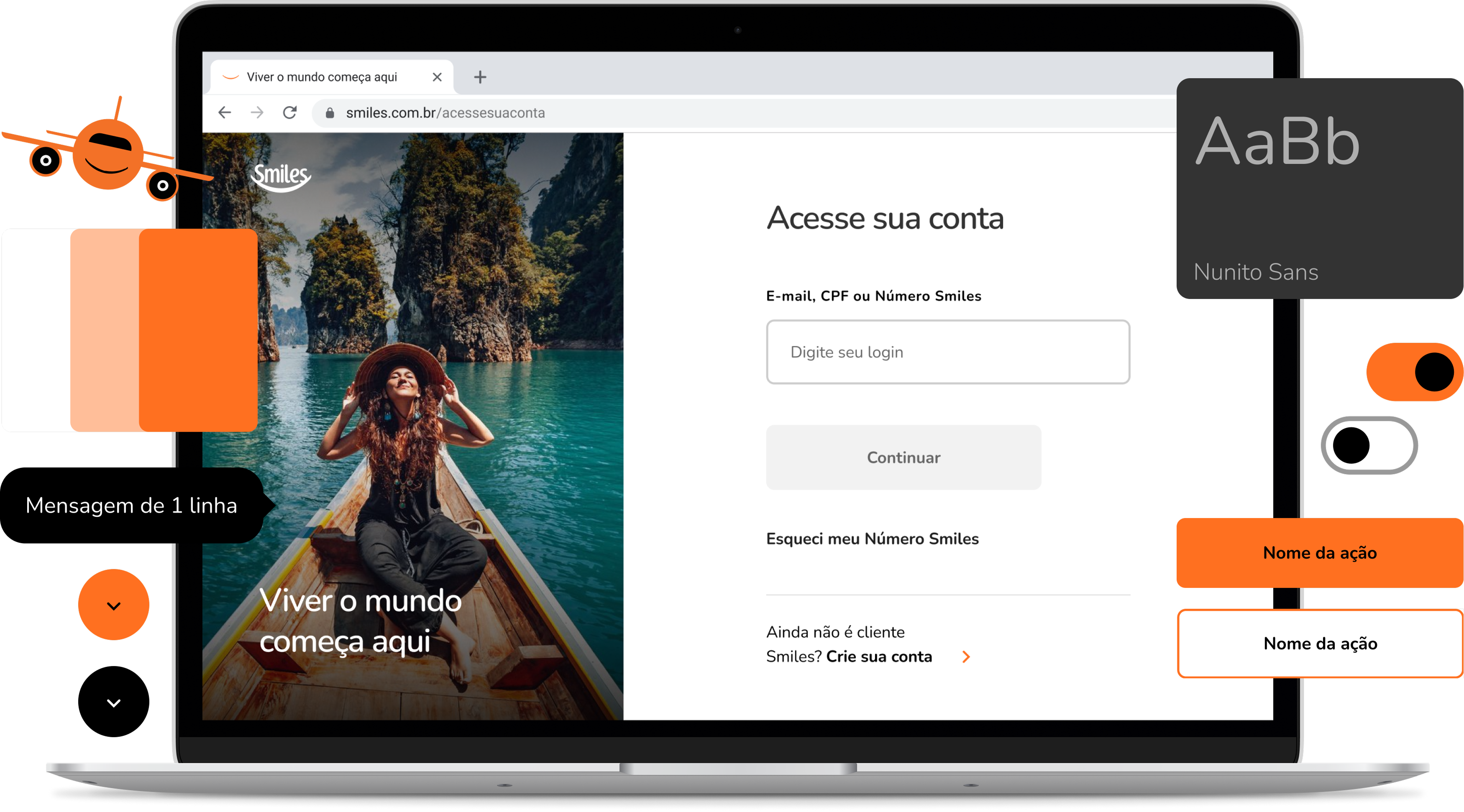
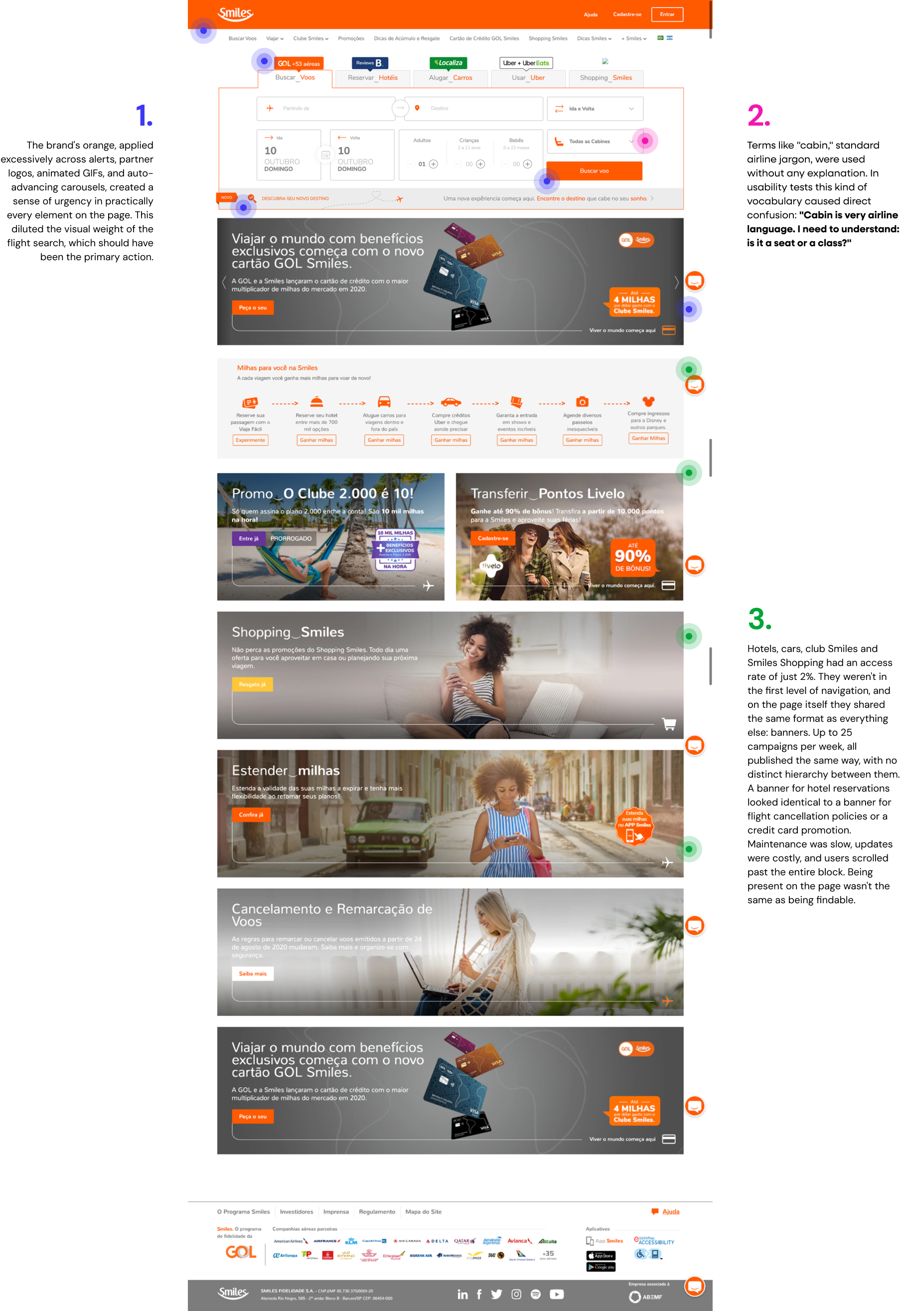
When I joined the project, the portal had a serious structural problem: multiple agencies were working simultaneously, each responsible for different journeys, with no central alignment. The result was visual inconsistency across pages, no shared standards, and constant rework with little to no record of what had already been done. On top of that, almost all content was published as generic banners, with up to 25 campaigns per week, making maintenance slow and the experience largely irrelevant to users.
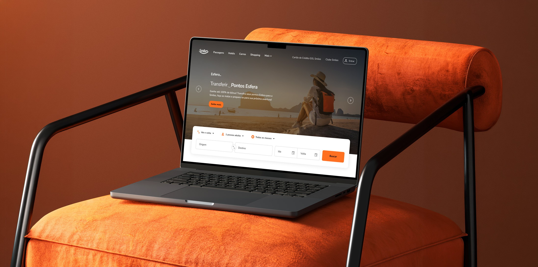
The challenge was to modernize the site, translate the new brand guidelines into digital, and bring the experience closer to the visual identity of the broader GOL group.
My role
I worked as a mid-level Product Designer paired with a UX Designer, within a larger team that included a UX Writer and a Design Lead. My focus was the visual direction, component creation and maintenance, and screen execution across all project phases.
I had direct client contact: I participated in daily meetups with core stakeholders and in bi-weekly presentations to the wider team, where we had to justify and defend design decisions to a broad audience with varying levels of familiarity with the design process.
Where to begin
With a fragmented portal and no shared standards, the temptation would have been to redesign everything at once. We didn't do that.
We started with the logged-in areas, such as account management flows, for three reasons: lower visual complexity, higher business urgency, and a more controlled environment to test and validate patterns before moving to more exposed pages.
At the same time, we inventoried the existing content, benchmarked how other companies in the space organized their information, and began building the component library. This happened in parallel from the start: as flows were designed, tested, and validated, the components were documented and shared across tracks. Building the library alongside the work, rather than after it, is what made consistency possible across such a fragmented product. It later served as the foundation for the Tangerina Design System, launched by Smiles after the project.
What the data said about the old website
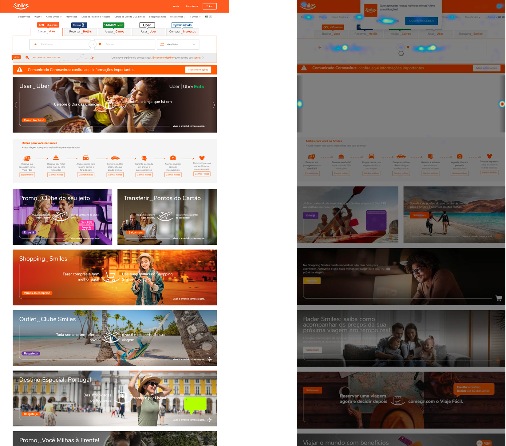
Before redesigning anything, we analyzed real user behavior on the existing site. Data painted a clear picture:
Only 38.5% of users reached the end of the flight deals section on the Homepage, and only 32.8% made it to the static banner below it. Content further down the page simply wasn't being seen.
The access rate for complementary products (hotels, cars, Shopping) was just 2%.
These findings, combined with insights from user interviews conducted before, which identified themes like confusion between the club and the loyalty program, focus on the travel goal, and differences between desktop and mobile, shaped our priorities from the start.
Usability test participant
"I'm already tired just looking at all this orange and things flashing around."
Usability test participant
"It feels like everything is crammed together. Lots of things repeated."
Design decisions
Translating the new brand guidelines into the interface
The new Smiles brand guidelines introduced a more sophisticated visual language aligned with the GOL group: less orange as the dominant color, more destination photography, and a feel closer to the world of travel than to a points program. The challenge was translating that into interface decisions without losing brand identity or creating friction for users who already knew the site.
I used orange more deliberately: present in interactive and highlight elements, but not competing with the content. Destination photography came in as the visual language of the showcases, replacing generic images of people.
Hero and flight search
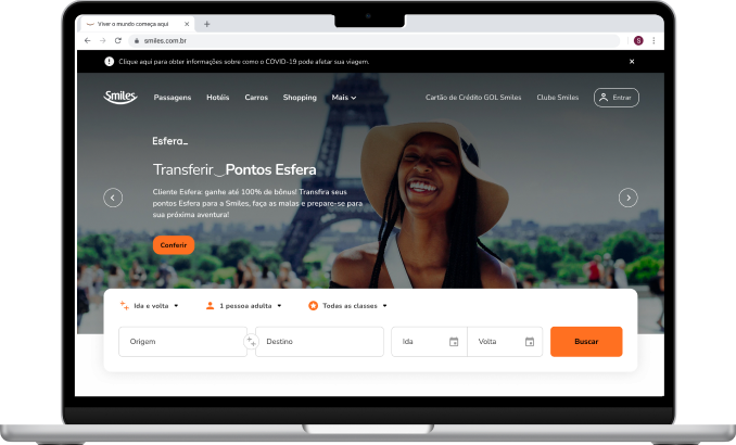
I repositioned the search component over the offer carousel, with a dark overlay applied to the images. The decision was intentional: I wanted users to feel, when clicking into the search field, that they had entered a focus mode. The darkened background removes any visual competition and clearly signals that the primary action is underway.
I reorganized the fields to reflect the natural thinking process of someone searching for a flight: origin, destination, date. I visually differentiated the required fields (airports and dates) from items with preset defaults (trip type, passengers, cabin class), making the form easier to scan.
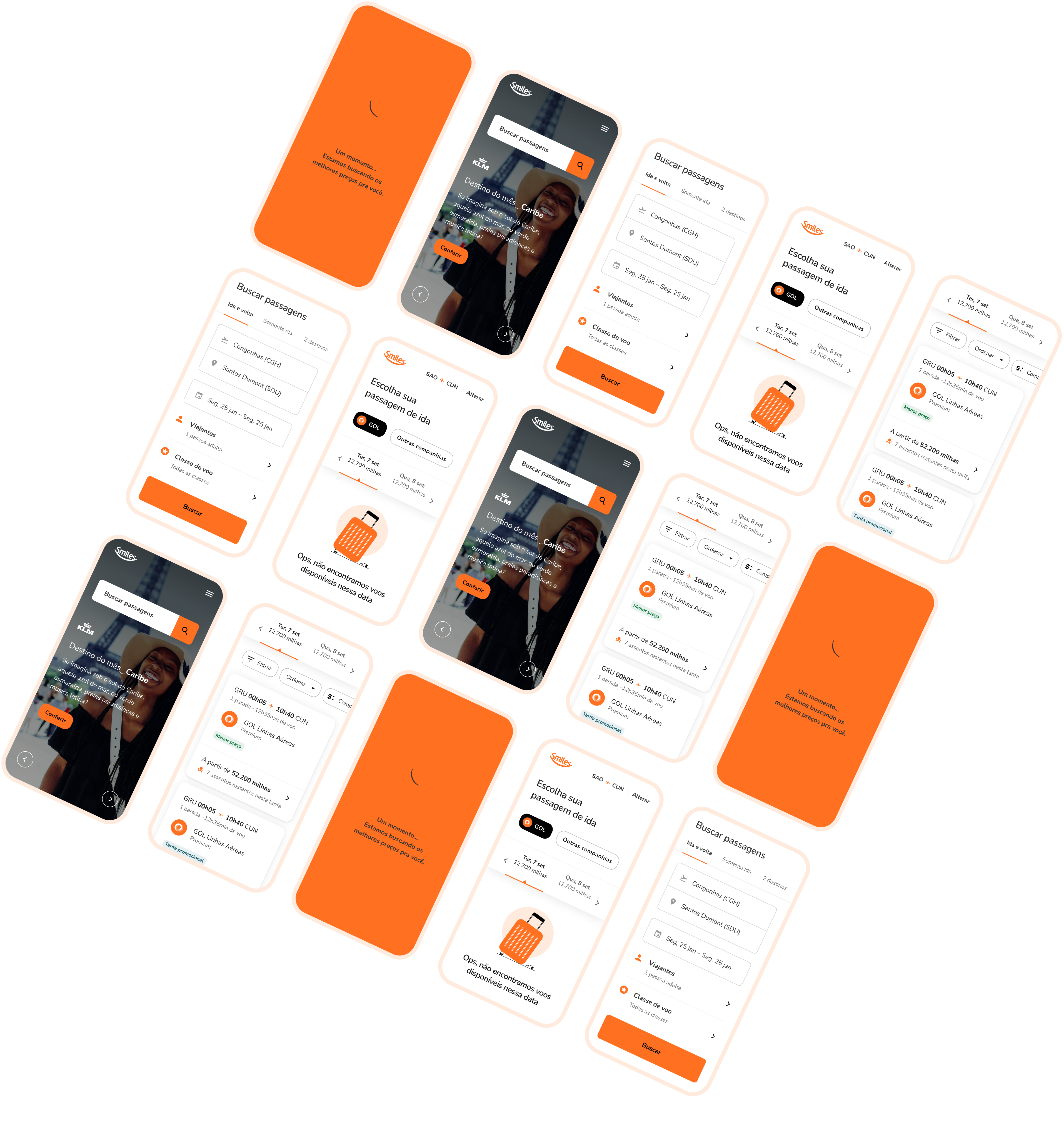
On mobile, I introduced a compact version that keeps the offers visible on the first fold. When the user interacts with it, a dedicated search page overlays the content with all fields available, solving the cross-device inconsistency without sacrificing content space.
THEMED SHOWCASES
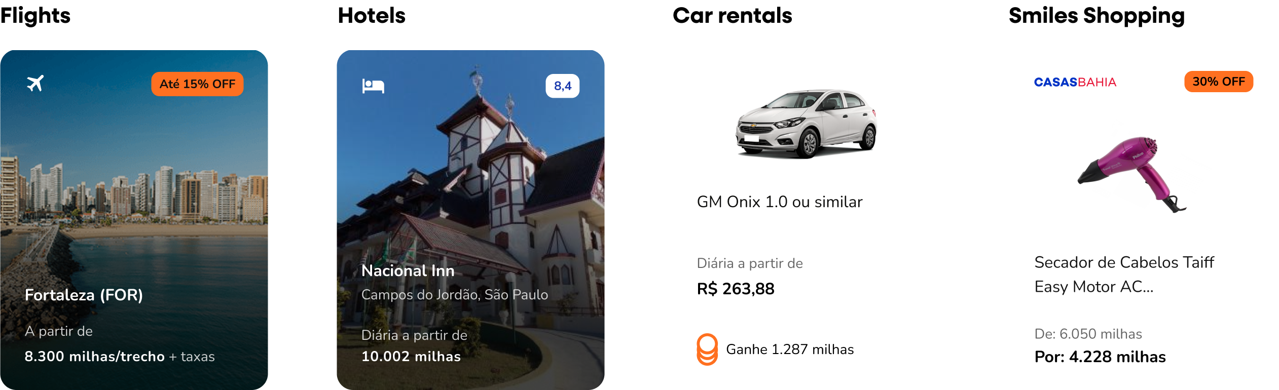
Instead of keeping products in generic banners, I proposed themed showcases: one module per category (flights, hotels, cars, Smiles Shopping), each with a horizontal card carousel, its own visual hierarchy, and product-specific imagery, such as city photos for flights, room photos for hotels, and product images for the Shopping section.
The choice of cards in a horizontal carousel was deliberate: each product has its own image that is an essential part of the purchase decision, and horizontal scrolling is an established pattern that lets you surface many options without extending the page vertically. The modules can be reordered, activated, or deactivated depending on context, solving the maintenance problem entirely.
In parallel, another team was working on personalized recommendations based on customer profiles and behavior. The showcase structure I built was reused in those contexts as well, including suggestions shown after a flight purchase.
Outcome
The Homepage redesign put flight search back at the center of the experience and organized complementary products in a way that allowed them to actually be found. But the impact went beyond the Homepage itself. The component library, built in parallel throughout the project, became a shared reference across tracks, reducing rework and bringing consistency to a portal that had started entirely fragmented. It ended up shaping the direction of the whole ecosystem.
Click to see the prototype
← Previous work

Smiles
Website homepage redesign · 2021
Context
Smiles is GOL airline's loyalty program. Its website is the main channel for booking flights with miles and accessing products like hotel reservations, car rentals, and the Smiles Shopping marketplace.
When I joined the project, the portal had a serious structural problem: multiple agencies were working simultaneously, each responsible for different journeys, with no central alignment. The result was visual inconsistency across pages, no shared standards, and constant rework with little to no record of what had already been done. On top of that, almost all content was published as generic banners, with up to 25 campaigns per week, making maintenance slow and the experience largely irrelevant to users.
The challenge was to modernize the site, translate the new brand guidelines into digital, and bring the experience closer to the visual identity of the broader GOL group.
My role
I worked as a mid-level Product Designer paired with a UX Designer, within a larger team that included a UX Writer and a Design Lead. My focus was the visual direction, component creation and maintenance, and screen execution across all project phases.
I had direct client contact: I participated in daily meetups with core stakeholders and in bi-weekly presentations to the wider team, where we had to justify and defend design decisions to a broad audience with varying levels of familiarity with the design process.
Where to begin
With a fragmented portal and no shared standards, the temptation would have been to redesign everything at once. We didn't do that.
We started with the logged-in areas, such as account management flows, for three reasons: lower visual complexity, higher business urgency, and a more controlled environment to test and validate patterns before moving to more exposed pages.
At the same time, we inventoried the existing content, benchmarked how other companies in the space organized their information, and began building the component library. This happened in parallel from the start: as flows were designed, tested, and validated, the components were documented and shared across tracks. Building the library alongside the work, rather than after it, is what made consistency possible across such a fragmented product. It later served as the foundation for the Tangerina Design System, launched by Smiles after the project.
What the data said about the old website
Before redesigning anything, we analyzed real user behavior on the existing site. Data painted a clear picture:
Only 38.5% of users reached the end of the flight deals section on the Homepage, and only 32.8% made it to the static banner below it. Content further down the page simply wasn't being seen.
The access rate for complementary products (hotels, cars, Shopping) was just 2%.
These findings, combined with insights from user interviews conducted before, which identified themes like confusion between the club and the loyalty program, focus on the travel goal, and differences between desktop and mobile, shaped our priorities from the start.
Usability test participant
"I'm already tired just looking at all this orange and things flashing around."
Usability test participant
"It feels like everything is crammed together. Lots of things repeated."
Design decisions
Translating the new brand guidelines into the interface
The new Smiles brand guidelines introduced a more sophisticated visual language aligned with the GOL group: less orange as the dominant color, more destination photography, and a feel closer to the world of travel than to a points program. The challenge was translating that into interface decisions without losing brand identity or creating friction for users who already knew the site.
I used orange more deliberately: present in interactive and highlight elements, but not competing with the content. Destination photography came in as the visual language of the showcases, replacing generic images of people.
Hero and flight search
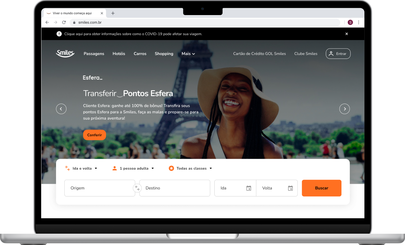
I repositioned the search component over the offer carousel, with a dark overlay applied to the images. The decision was intentional: I wanted users to feel, when clicking into the search field, that they had entered a focus mode. The darkened background removes any visual competition and clearly signals that the primary action is underway.
I reorganized the fields to reflect the natural thinking process of someone searching for a flight: origin, destination, date. I visually differentiated the required fields (airports and dates) from items with preset defaults (trip type, passengers, cabin class), making the form easier to scan.
On mobile, I introduced a compact version that keeps the offers visible on the first fold. When the user interacts with it, a dedicated search page overlays the content with all fields available, solving the cross-device inconsistency without sacrificing content space.
THEMED SHOWCASES
Instead of keeping products in generic banners, I proposed themed showcases: one module per category (flights, hotels, cars, Smiles Shopping), each with a horizontal card carousel, its own visual hierarchy, and product-specific imagery, such as city photos for flights, room photos for hotels, and product images for the Shopping section.
The choice of cards in a horizontal carousel was deliberate: each product has its own image that is an essential part of the purchase decision, and horizontal scrolling is an established pattern that lets you surface many options without extending the page vertically. The modules can be reordered, activated, or deactivated depending on context, solving the maintenance problem entirely.
In parallel, another team was working on personalized recommendations based on customer profiles and behavior. The showcase structure I built was reused in those contexts as well, including suggestions shown after a flight purchase.
Outcome
The Homepage redesign put flight search back at the center of the experience and organized complementary products in a way that allowed them to actually be found. But the impact went beyond the Homepage itself. The component library, built in parallel throughout the project, became a shared reference across tracks, reducing rework and bringing consistency to a portal that had started entirely fragmented. It ended up shaping the direction of the whole ecosystem.
Click to see the prototype
← Previous work

Smiles
Website homepage redesign · 2021
Context
Smiles is GOL airline's loyalty program. Its website is the main channel for booking flights with miles and accessing products like hotel reservations, car rentals, and the Smiles Shopping marketplace.
When I joined the project, the portal had a serious structural problem: multiple agencies were working simultaneously, each responsible for different journeys, with no central alignment. The result was visual inconsistency across pages, no shared standards, and constant rework with little to no record of what had already been done. On top of that, almost all content was published as generic banners, with up to 25 campaigns per week, making maintenance slow and the experience largely irrelevant to users.
The challenge was to modernize the site, translate the new brand guidelines into digital, and bring the experience closer to the visual identity of the broader GOL group.
My role
I worked as a mid-level Product Designer paired with a UX Designer, within a larger team that included a UX Writer and a Design Lead. My focus was the visual direction, component creation and maintenance, and screen execution across all project phases.
I had direct client contact: I participated in daily meetups with core stakeholders and in bi-weekly presentations to the wider team, where we had to justify and defend design decisions to a broad audience with varying levels of familiarity with the design process.
Where to begin
With a fragmented portal and no shared standards, the temptation would have been to redesign everything at once. We didn't do that.
We started with the logged-in areas, such as account management flows, for three reasons: lower visual complexity, higher business urgency, and a more controlled environment to test and validate patterns before moving to more exposed pages.
At the same time, we inventoried the existing content, benchmarked how other companies in the space organized their information, and began building the component library. This happened in parallel from the start: as flows were designed, tested, and validated, the components were documented and shared across tracks. Building the library alongside the work, rather than after it, is what made consistency possible across such a fragmented product. It later served as the foundation for the Tangerina Design System, launched by Smiles after the project.
What the data said about the old website
Before redesigning anything, we analyzed real user behavior on the existing site. Data painted a clear picture:
Only 38.5% of users reached the end of the flight deals section on the Homepage, and only 32.8% made it to the static banner below it. Content further down the page simply wasn't being seen.
The access rate for complementary products (hotels, cars, Shopping) was just 2%.
These findings, combined with insights from user interviews conducted before, which identified themes like confusion between the club and the loyalty program, focus on the travel goal, and differences between desktop and mobile, shaped our priorities from the start.
Usability test participant
"I'm already tired just looking at all this orange and things flashing around."
Usability test participant
"It feels like everything is crammed together. Lots of things repeated."
Design decisions
Translating the new brand guidelines into the interface
The new Smiles brand guidelines introduced a more sophisticated visual language aligned with the GOL group: less orange as the dominant color, more destination photography, and a feel closer to the world of travel than to a points program. The challenge was translating that into interface decisions without losing brand identity or creating friction for users who already knew the site.
I used orange more deliberately: present in interactive and highlight elements, but not competing with the content. Destination photography came in as the visual language of the showcases, replacing generic images of people.
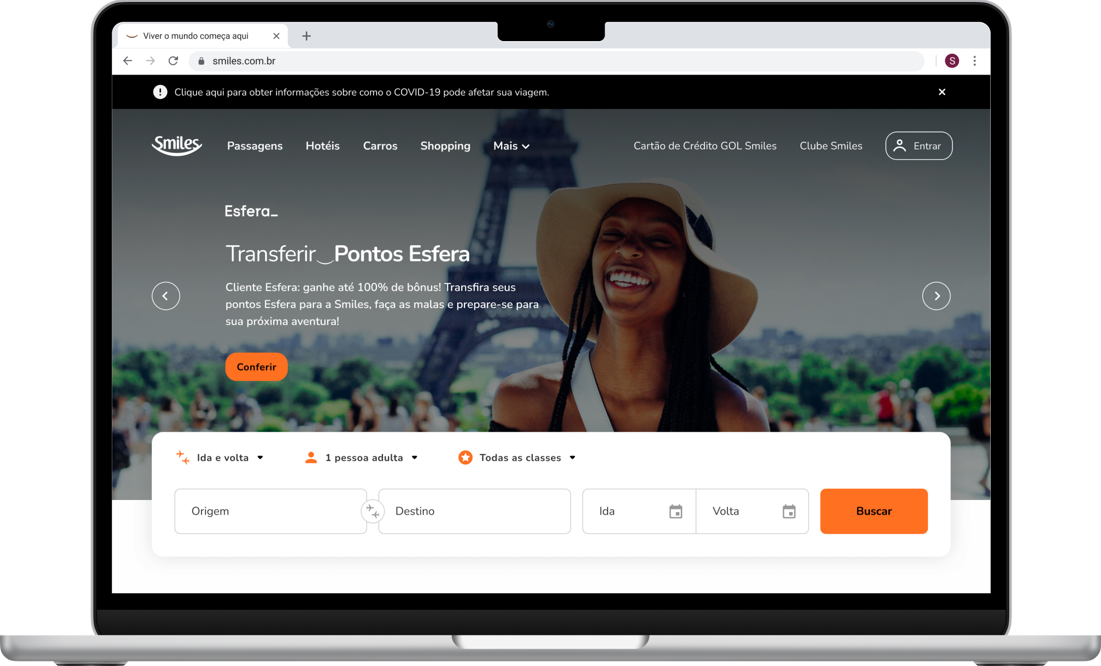
Hero and flight search
I repositioned the search component over the offer carousel, with a dark overlay applied to the images. The decision was intentional: I wanted users to feel, when clicking into the search field, that they had entered a focus mode. The darkened background removes any visual competition and clearly signals that the primary action is underway.
I reorganized the fields to reflect the natural thinking process of someone searching for a flight: origin, destination, date. I visually differentiated the required fields (airports and dates) from items with preset defaults (trip type, passengers, cabin class), making the form easier to scan.
On mobile, I introduced a compact version that keeps the offers visible on the first fold. When the user interacts with it, a dedicated search page overlays the content with all fields available, solving the cross-device inconsistency without sacrificing content space.
THEMED SHOWCASES
Instead of keeping products in generic banners, I proposed themed showcases: one module per category (flights, hotels, cars, Smiles Shopping), each with a horizontal card carousel, its own visual hierarchy, and product-specific imagery, such as city photos for flights, room photos for hotels, and product images for the Shopping section.
The choice of cards in a horizontal carousel was deliberate: each product has its own image that is an essential part of the purchase decision, and horizontal scrolling is an established pattern that lets you surface many options without extending the page vertically. The modules can be reordered, activated, or deactivated depending on context, solving the maintenance problem entirely.
In parallel, another team was working on personalized recommendations based on customer profiles and behavior. The showcase structure I built was reused in those contexts as well, including suggestions shown after a flight purchase.
Outcome
The Homepage redesign put flight search back at the center of the experience and organized complementary products in a way that allowed them to actually be found. But the impact went beyond the Homepage itself. The component library, built in parallel throughout the project, became a shared reference across tracks, reducing rework and bringing consistency to a portal that had started entirely fragmented. It ended up shaping the direction of the whole ecosystem.
Click to see the prototype
← Previous work

Smiles
Website homepage redesign · 2021
Context
Smiles is GOL airline's loyalty program. Its website is the main channel for booking flights with miles and accessing products like hotel reservations, car rentals, and the Smiles Shopping marketplace.
When I joined the project, the portal had a serious structural problem: multiple agencies were working simultaneously, each responsible for different journeys, with no central alignment. The result was visual inconsistency across pages, no shared standards, and constant rework with little to no record of what had already been done. On top of that, almost all content was published as generic banners, with up to 25 campaigns per week, making maintenance slow and the experience largely irrelevant to users.
The challenge was to modernize the site, translate the new brand guidelines into digital, and bring the experience closer to the visual identity of the broader GOL group.
My role
I worked as a mid-level Product Designer paired with a UX Designer, within a larger team that included a UX Writer and a Design Lead. My focus was the visual direction, component creation and maintenance, and screen execution across all project phases.
I had direct client contact: I participated in daily meetups with core stakeholders and in bi-weekly presentations to the wider team, where we had to justify and defend design decisions to a broad audience with varying levels of familiarity with the design process.
Where to begin
With a fragmented portal and no shared standards, the temptation would have been to redesign everything at once. We didn't do that.
We started with the logged-in areas, such as account management flows, for three reasons: lower visual complexity, higher business urgency, and a more controlled environment to test and validate patterns before moving to more exposed pages.
At the same time, we inventoried the existing content, benchmarked how other companies in the space organized their information, and began building the component library. This happened in parallel from the start: as flows were designed, tested, and validated, the components were documented and shared across tracks. Building the library alongside the work, rather than after it, is what made consistency possible across such a fragmented product. It later served as the foundation for the Tangerina Design System, launched by Smiles after the project.
What the data said about the old website
Before redesigning anything, we analyzed real user behavior on the existing site. Data painted a clear picture:
Only 38.5% of users reached the end of the flight deals section on the Homepage, and only 32.8% made it to the static banner below it. Content further down the page simply wasn't being seen.
The access rate for complementary products (hotels, cars, Shopping) was just 2%.
These findings, combined with insights from user interviews conducted before, which identified themes like confusion between the club and the loyalty program, focus on the travel goal, and differences between desktop and mobile, shaped our priorities from the start.
Usability test participant
"I'm already tired just looking at all this orange and things flashing around."
Usability test participant
"It feels like everything is crammed together. Lots of things repeated."
Design decisions
Translating the new brand guidelines into the interface
The new Smiles brand guidelines introduced a more sophisticated visual language aligned with the GOL group: less orange as the dominant color, more destination photography, and a feel closer to the world of travel than to a points program. The challenge was translating that into interface decisions without losing brand identity or creating friction for users who already knew the site.
I used orange more deliberately: present in interactive and highlight elements, but not competing with the content. Destination photography came in as the visual language of the showcases, replacing generic images of people.
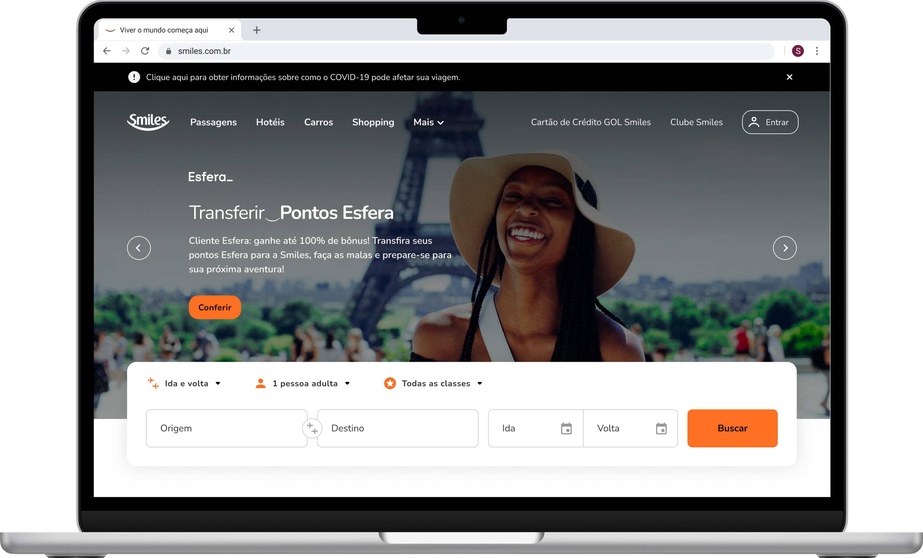
Hero and flight search
I repositioned the search component over the offer carousel, with a dark overlay applied to the images. The decision was intentional: I wanted users to feel, when clicking into the search field, that they had entered a focus mode. The darkened background removes any visual competition and clearly signals that the primary action is underway.
I reorganized the fields to reflect the natural thinking process of someone searching for a flight: origin, destination, date. I visually differentiated the required fields (airports and dates) from items with preset defaults (trip type, passengers, cabin class), making the form easier to scan.
On mobile, I introduced a compact version that keeps the offers visible on the first fold. When the user interacts with it, a dedicated search page overlays the content with all fields available, solving the cross-device inconsistency without sacrificing content space.
THEMED SHOWCASES
Instead of keeping products in generic banners, I proposed themed showcases: one module per category (flights, hotels, cars, Smiles Shopping), each with a horizontal card carousel, its own visual hierarchy, and product-specific imagery, such as city photos for flights, room photos for hotels, and product images for the Shopping section.
The choice of cards in a horizontal carousel was deliberate: each product has its own image that is an essential part of the purchase decision, and horizontal scrolling is an established pattern that lets you surface many options without extending the page vertically. The modules can be reordered, activated, or deactivated depending on context, solving the maintenance problem entirely.
In parallel, another team was working on personalized recommendations based on customer profiles and behavior. The showcase structure I built was reused in those contexts as well, including suggestions shown after a flight purchase.
Outcome
The Homepage redesign put flight search back at the center of the experience and organized complementary products in a way that allowed them to actually be found. But the impact went beyond the Homepage itself. The component library, built in parallel throughout the project, became a shared reference across tracks, reducing rework and bringing consistency to a portal that had started entirely fragmented. It ended up shaping the direction of the whole ecosystem.
Click to see the prototype
← Previous work